What color does Coca Cola use in their logo? Right, and what about Heineken? Ding-ding you are absolutely right again. Choosing the right brand colors will benefit your business greatly. Now you might think that you know these colors because the brands are huge. However, there are plenty of large companies without a face. Research backs this up with proof of how brand colors affect your customer.
“Customers form their opinion about a product or service within 90 seconds. People judge those products mostly on its color”
In today’s article you will learn:
- Get more customers simply by choosing the right brand color
- How you can influence your customer buying behavior
- The most popular color
- A branding technique to make your logo stand out from the rest
Let’s get started and select the right brand color for you!
Why Would You Care About Your Brand Colors?
So what’s in it for you? Why would you care about the colors you are using? The simple answer is: you will attract more customers.
Whether customers know it or not, they are being influenced by colors daily. The color of the product is the key factor in deciding whether they like a product or not. Using the right brand color will stimulate buyers to shop, but the wrong color will do the exact opposite.
But how does this exactly work? Colors trigger emotions. Our brains recognize colors and link them to a certain emotion. For example, red will make us think about blood. Blood means danger! We need to be alert and act powerfully. Many of these triggers are linked to biological conditioning for millions of years. For instance, the color blue only exists in this millennia because we were physically not able to see this color before. On the other hand, there are also new triggers being developed by social and cultural advancements.
Colors activate emotions and emotions activate customers into buying stuff.
1/3 Of The World Uses This Color!
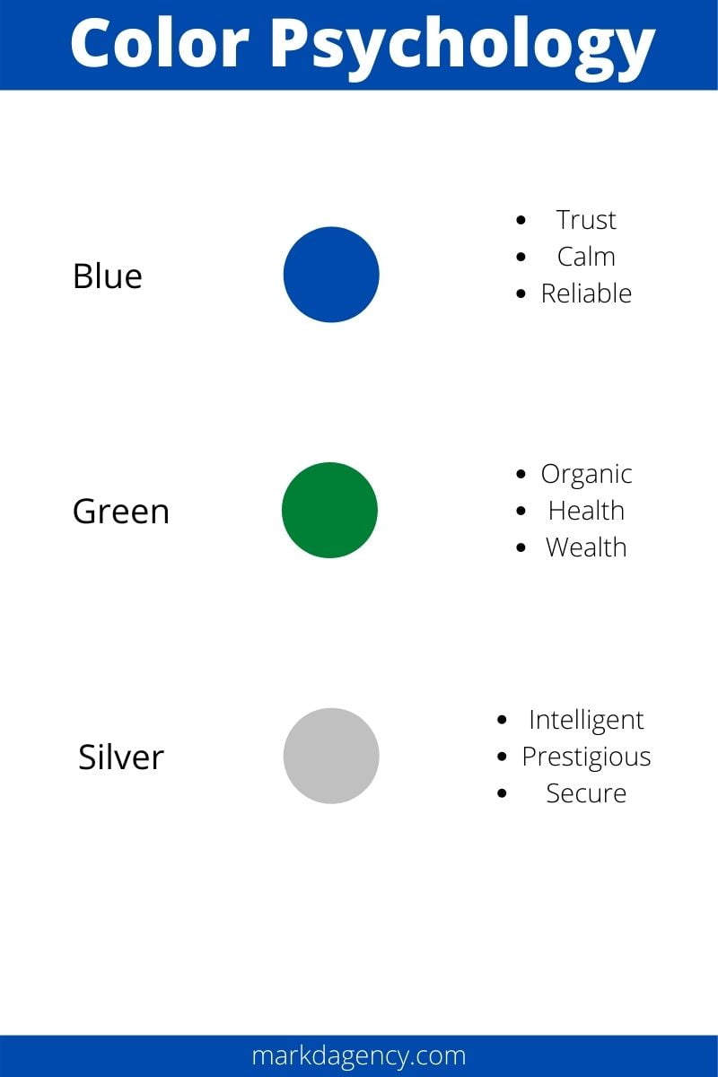
Did you know that 1/3 of the world uses the color blue in their logo? Blue means trustworthy and reliable. Therefore it’s no surprise so many businesses have adopted this color in their branding. After all, don’t you want to be seen as reliable? The one thing I don't like about this statistic is the total amount of businesses using your color. It will ask a lot from your logo design to stand out because the color is so common. From a branding perspective, I like to look and feel different. That's why we didn't go with popular colors like blue or green. However, the emotions that a color trigger is more important than standing out. A pink chainsaw will never sell well. The colors you choose need to make sense and fit your brand. If reliability is your core then blue can be the right pick for you!
The Best Brand Colors For You
Now that you know what brand colors can do for you, it’s time to choose the right colors for your business! In this chapter, we will walk you through different colors and which emotions they trigger in the human brain. Afterward, I advise you to grab a pen and write down what emotions you want to trigger in your customer. Then use the color schemes below to look up which brand colors would match your criteria. This exercise can be done in 15 minutes.
Color Psychology – Trigger The Right Emotion
Time to dive into color psychology. Which emotion do different colors trigger?
Yellow
Yellow stands for happiness and optimism. It's a color that helps to get customers in a good mood. It can also be used to get attention and stand for affordability. One company that makes use of this is Best Buy! Their logo combined with the brand color screams affordable and warmth. Yellow is often a good choice for retail businesses.

Source: Best Buy

Source: Amazon
Orange
The color of youthfulness and innovation, orange is rarer than most colors. It embodies the emotions of innovative, young, fresh, and upcoming. Therefore it was a great fit for Amazon! Amazon innovated the way we shop and is a relatively young company. If you look at their logo below, you will see that they used orange to create a smile with the arrow. Orange is also associated with cheerfulness, that's why Amazon chose this color for the smiley face logo.
Amazon also makes great use of contrast with the black and orange. More about that later on in the article!
Red
Red is an aggressive, bold, and powerful color meant to grab your attention. It suites companies that want to take the market by force. This red approach definitely works because the number 1 best recognizable brand is using red. We are talking about Coca Cola! Red is a perfect fit for Coca Cola because red stands for excitement. This is exactly what Coca Cola wants to trigger when people think about their product. Just think about their commercials. It's either about love or other exciting topics. The king of branding chose its branding color wisely.

Source: Coca Cola

Source: Yahoo
Purple
Purple is a bit of strange brand color, to be honest. It's not a popular color because it's often difficult to use it on the packaging. However, there are definitely benefits if it fits with your product. Purple is associated with premium, creativity, and being wise. The last one was the reason for Yahoo to use purple. Yahoo is a web service company. You want those to be wise and all-knowing when you ask them a question right?
Blue
The color of trust and reliability, blue is often used in the tech world. Companies like HP, Intel, and Samsung make use of the color blue. The products sold by the tech industry often come with a price tag. They are big purchases that require a higher level of trust than a discount shop for instance. And as you know, you only have 90 seconds to convince your customer. That’s why picking the color of trust and reliability will help you create this level of trust.
Source: HP
Source: Starbucks
Green
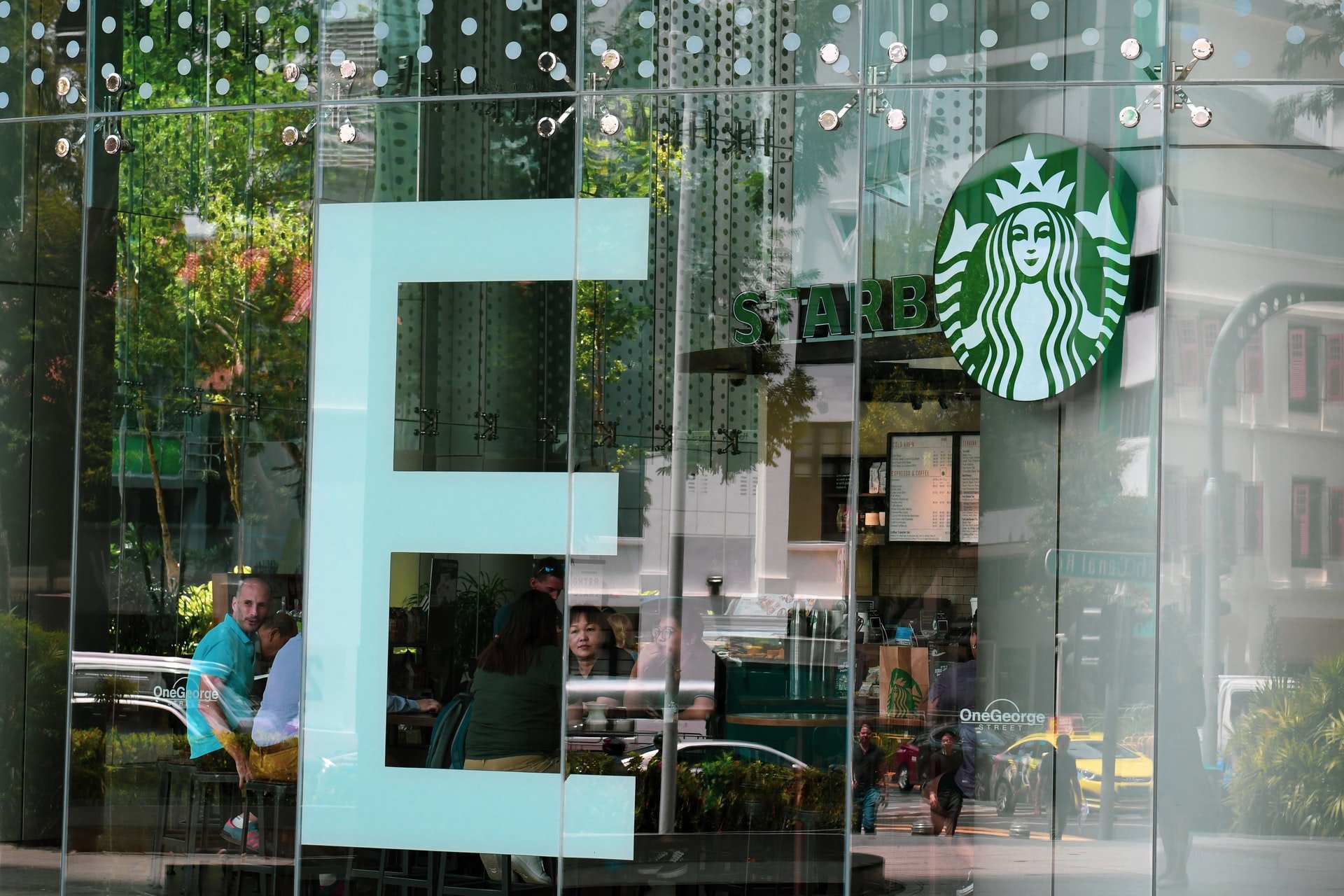
Green is the color of health & wealth. It is often linked to the feeling of having a good life. You sit in the back of a very comfortable chair, reading a paper while the rain is making little ticking noises on the window. The barista comes to your table and gives you an organic coffee. Hmm, life is good. Green is the color of life and is increasingly becoming more popular. The main reason for this is because humankind is focusing more on quality living. Less stress and work, more health and wealth. One of the reasons why it matches everything that Starbucks stands for.
Silver
The prestigious silver gives a sense of intelligence and security. Probably the best example of the color silver is Apple. Apple is not only highly secured with its iOS system, but Apple also has a feeling of prestige. You are not buying a computer. No, you are buying an iMac. You are part of a prestigious group driven by intellect. Silver is a color that is meant for brands that have high ticket products or services.

Source: Apple
Brand Colors Psychology Overview
Below you will find our first color scheme linked with the emotions they trigger.
Use Contrast To Electrify Your Logo
There is one more trick we want to teach you and that’s contrast. Consumers see hundreds of logos and brands daily. Imagine that your logo is on a shelf between 100 other logos. It seems impossible to stand out. However, mother nature has a solution for you! Our eyes pick up controversial changes in our surroundings. This is mainly biological protection to recognize danger on the horizon e.g. predators hiding in the bushes.
But now our customers can use it to spot our products! Much better use of this biological feature I would say. Below you will find the Mark’d Agency logo. Both logos are made in 3 colors and the same size. Now, which one attracts your eye?

The one above? No, too boring and it doesn’t attract your eye, right?
Now the second one is driving your eye towards it. It has even become more difficult to read this text because your brain is trying to identify the logo. Now the only thing we changed is contrast. We still worked with 3 different colors and the same size, but it’s the controversial coloring that activates the oldest part of our brains. The same part where our emotions are stored.
The logo stands out and looks fresh. Remember the 90 seconds rule? Customers will decide what they think about your brand based on colors within 90 seconds. Making use of this color contrast technique will positively affect this decision-making process.
Tip: start using color contrast in more business assets. Not only in your logo but also your packaging, blogs, handouts, etc. It will attract your customer's eye!
Want To Learn How To Brand Yourself?
Do you want to learn how to brand yourself? In this ultimate guide we tell you all we know about branding. From the difference between marketing and branding to the best branding tools that we use every single day.
Finally, if you are looking for a good tool to get more organic visitors to your website, check out our KWFinder review!
If you have any questions about the psychology behind color branding, please leave a comment below, or email us at info@markdagency.com.

